Mobile-friendly website: 10 tips for a mobile-optimized website
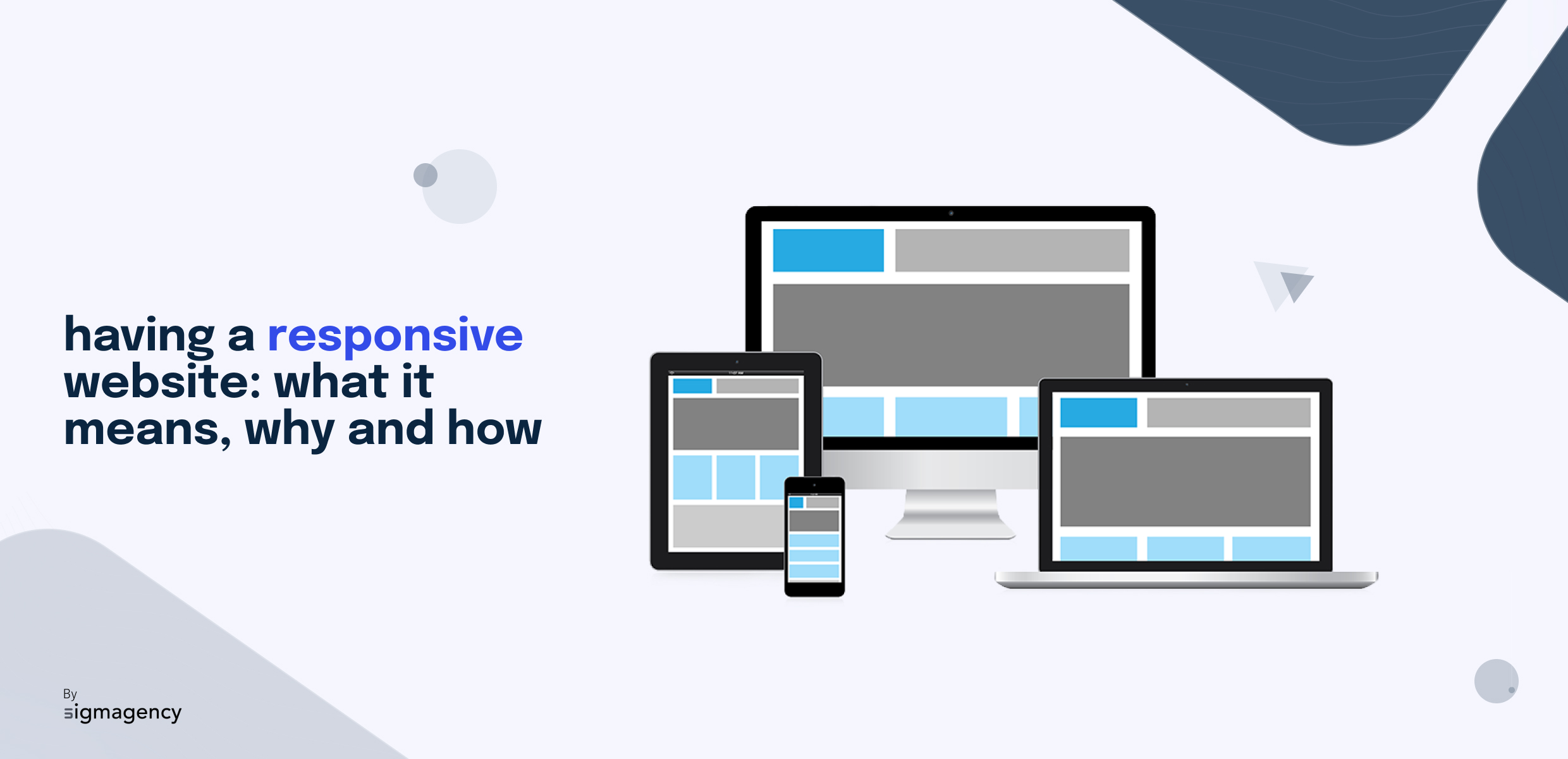
Today, information, services and entertainment are increasingly accessed via mobile devices such as smartphones and tablets. The statistics don't lie: mobile traffic represents a significant proportion of Internet traffic. If your site isn't optimized for mobile users, you risk losing a valuable audience. Today, having a responsive website is a must.
But it's not that simple. Mobile users are demanding, and they expect smooth navigation, fast loading times and impeccable aesthetics. To help you ensure that your website meets these high expectations, we've put together 10 essential tips in this article. These tips will help you create a mobile experience that will appeal to your visitors, boost your site's SEO and stimulate audience growth. Ready to optimize your website for mobile?