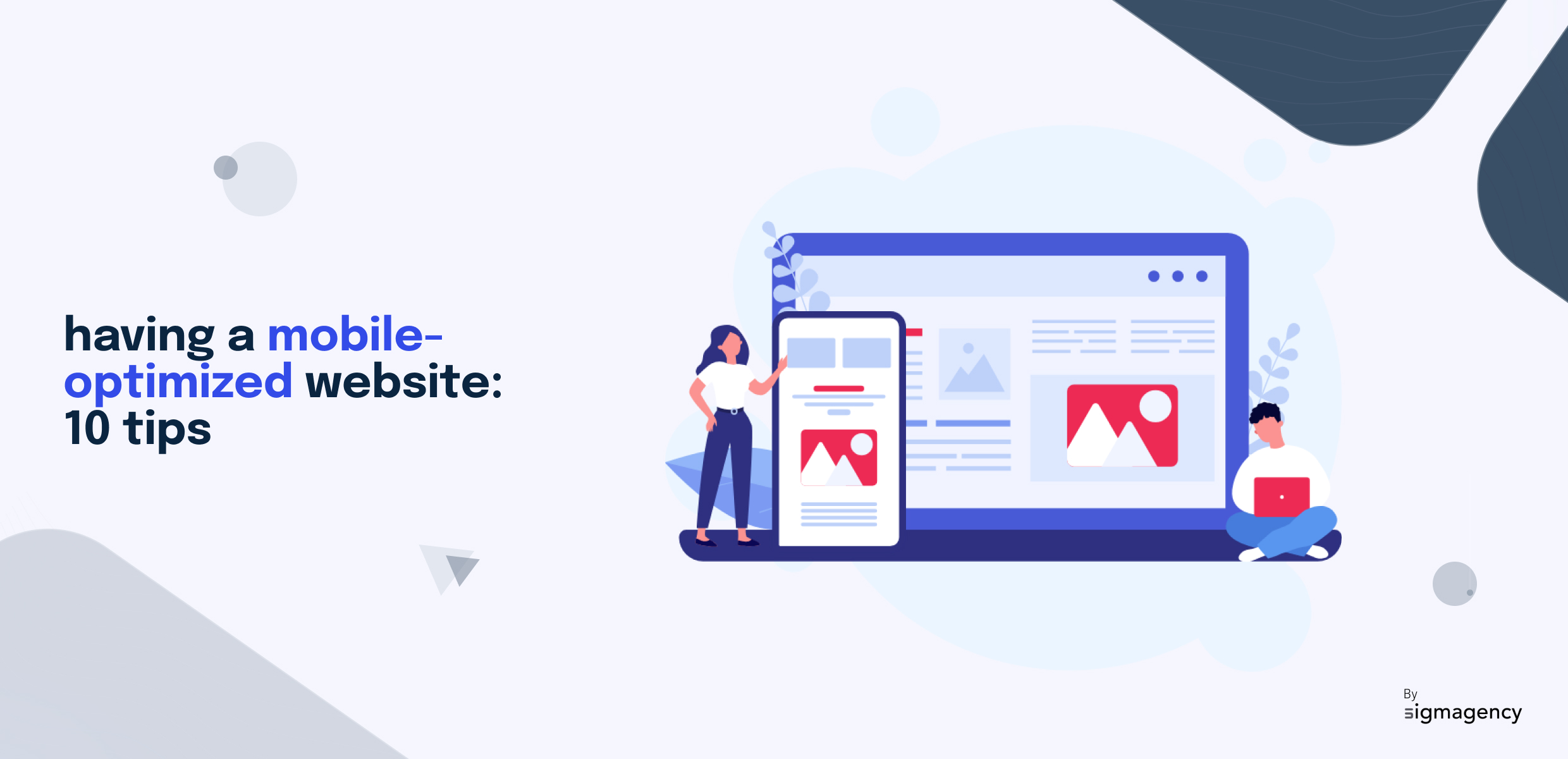
1. Adopt Responsive Design
Responsive design means creating a site that adapts to different devices. Having a responsive website, allows you to have a site optimized for mobile, tablet and computer that will adjust to the size of the screen in question. This allows users to have an optimized experience on all their devices, accessing the same content even though it will be adjusted to the desired format.
To do this, you need media queries. These enable you to create a flexible layout. How does it work? Using media queries will enable the website to detect the characteristics of the user’s device or screen, such as its width or resolution, and then apply specific CSS rules accordingly. This enables the site to automatically adjust itself to offer an optimal experience, whether the user is using a computer, tablet or smartphone.
2. Simplify structure
A mobile device’s screen is smaller than a computer’s, so you need to rethink the organization of your information to optimize your site for phones and tablets. The aim is to make essential information appear as clearly as possible.
To achieve this, you can:
- Use one or two columns of text.
- Reduce the number of pages on your site.
- Create a compact navigation menu.
- Integrate a more visible search bar.
- Differentiate your content zones with blank spaces.
3. Optimize images
In addition to responsive design, image optimization plays a crucial role. Heavy images can lead to longer loading times, which can discourage mobile visitors. It is therefore essential to compress images to improve loading speed.
4. Reduce loading time
Improving the speed of your website is a key factor in optimizing a site for mobile use. Every fraction of a second counts, as your site’s loading speed is the first thing your visitor evaluates. According to Google, a loading time in excess of 3 seconds increases the risk of bounce by 32%. In other words, almost a third of your potential customers could leave your site. It’s essential to bear in mind that mobile users are often more impatient than those on desktop computers.
5. Adapt content
Adapting content for your mobile site means, first and foremost, reducing it. Mobile users tend to scan pages quickly. So you need to reduce your content, concentrating only on the essentials, and make sure your content is clear, concise and relevant. And don’t hesitate to increase the size of your fonts to improve the legibility of your texts.
6. Avoid pop-ups
Pop-ups are extremely effective on the desktop for harvesting e-mail addresses, for example, but they are often perceived as intrusive. On mobile, it’s even worse: the pop-up often takes up the entire size of the phone, totally degrading the mobile user experience. We therefore advise you to limit their use. What’s more, Google now penalizes sites using intrusive pop-ups on mobile.
7. Enlarge call-to-action buttons
Call-to-action (CTA) buttons are essential elements to optimize for the mobile version of your own website. They’re the key to turning visitors into leads. So it’s essential that they’re large enough, recognizable and easy to click with the fingers.
8. Optimize mobile SEO
Optimizing mobile SEO is essential when you consider that the majority of website visits are made from a mobile device. So don’t neglect the mobile experience and its optimization. What’s more, search engines, especially Google, now favor mobile sites, which means that your ranking in search results largely depends on your site’s usability on mobile devices. Mobile SEO optimization is therefore essential for maintaining online visibility, delivering an outstanding user experience and ensuring the growth of your website and business.
9. Test your site on different platforms
It’s imperative to test your website on iOS and Android platforms before launching. These two operating systems dominate the mobile device market, and their compatibility is essential for reaching a diverse audience. However, they have different characteristics and browsers, such as Safari for iOS and Chrome for Android, which means that specific tests are required to ensure optimal compatibility. These tests enable us to adjust the layout, performance and interface to deliver a fluid user experience adapted to each system. They also detect platform-specific problems, such as CSS or JavaScript compatibility bugs, and correct them before the site is made available to the public.
10. Work with Sigmagency
If you don’t have the time to design your website yourself, or simply don’t have the skills, don’t worry – that’s what we’re here for. At Sigmagency, we take care of your digital strategy, interface design and development. What’s more, we make sure you get a site that’s optimized for mobile devices as well as for SEO. For more information, please contact us directly!
Sophie Mouton
Strategy & Marketing


