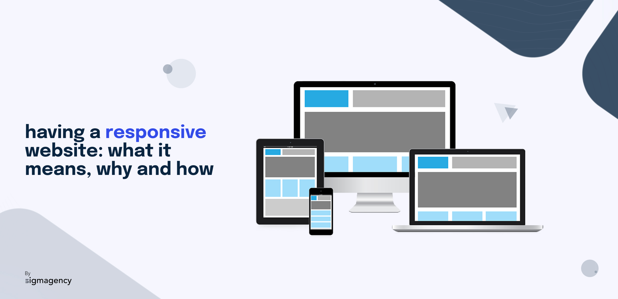
Having a responsive website: what does it mean, why and how?
Do you want a professional, ergonomic website that will help you generate traffic? Keep reading, this article is for you. We're going to share with you an essential best practice for achieving this: having a responsive website. Find out what a responsive website is, why it's important and how to get one.
A responsive website is a website that has been designed and developed to adapt to all screen resolutions. This means it can be viewed on a computer, smartphone or tablet.
Between a computer screen and that of a smartphone, there are big differences in resolution (number of dots, also called pixels, that the screen can display). A computer screen is generally 1024px or 1600px wide. A tablet, on the other hand, has a width of 1024px in landscape format, but 740px in portrait format. And for mobiles, it varies between 320px and 480px, depending on model and brand. All in all, that’s a lot of different sizes to take into account when designing your website.
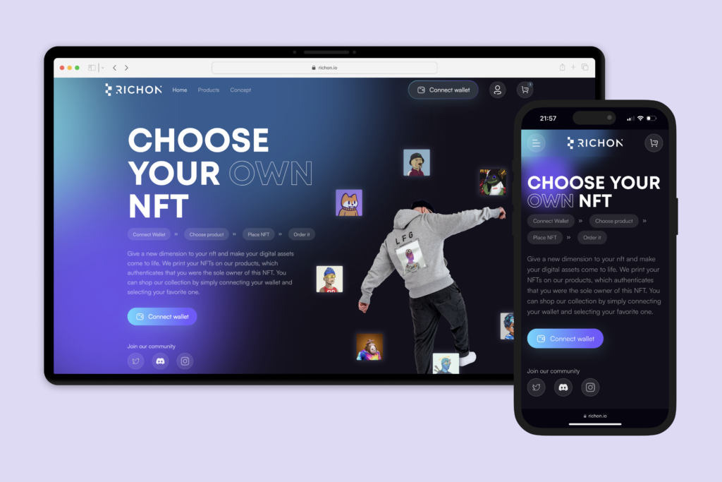
Responsive technology makes it possible to adapt the display of site elements to these different screen widths. Here’s an example of how one of our customers’ responsive website is displayed on a computer and phone.
When designing a website, you don’t know from which type of device your site will be viewed, so it’s essential to anticipate this question and design your website responsive from the outset.
Why is it important to have a responsive site?
There are many reasons why you should design your site to be responsive. Here are the 3 main ones:
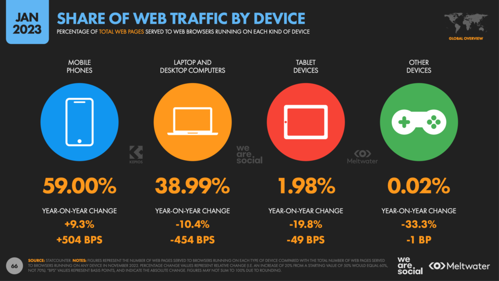
There are 5.44 billion mobile users in the world, representing 68% of the global population,
92.3% of users access the Internet via their mobile,
Mobile phones represent for 52.8% of time spent on the web
and mobile phones account for 59% of global web traffic
The study shows that the proportion of mobile users has been growing steadily in recent years. Faced with this trend, it’s essential to have a responsive website.
Improving search engine ranking
Google, the most widely used search engine, uses crawlers to detect and analyze the content and structure of your website, so that it can be optimally referenced. While it’s not mandatory to have a mobile version of your website in order to be indexed, it is strongly recommended, as the robots will detect and favour websites with a mobile-friendly version for indexing.
So, a website designed and thought out to adapt to mobile screens will be optimized in terms of natural referencing (SEO), and put forward by search engines compared to a site that isn’t.
Enhanced user experience
User experience is a key element in the success of a website. Users expect smooth navigation, well-presented content and optimal accessibility, regardless of the device used. Responsive design meets these expectations by providing a consistent and enjoyable user experience, automatically adjusting to offer optimal text legibility, well-sized images and intuitive functionality. This ensures positive interaction with your site and encourages visitors to stay on your site, thereby reducing the bounce rate.
How do I get a responsive site?
The mobile user must be at the heart of website design. It’s best to start by designing your mobile site before tackling the desktop version. This concept, which prioritizes the creation of content aimed at users of mobile devices, is known as “mobile first“. With mobiles accounting for nearly 60% of global web traffic, it’s essential to have a site optimized for them. We’ll talk more about best practices for a mobile-optimized website in another article.
To adapt content to different screen resolutions, you need to create breakpoints. In concrete terms, this means determining a particular size at which your content will switch to another display style. We advise you to create 3 or 4 display categories to cover the different devices your visitors might use to browse your website. To better understand the concept of breakpoints, try it out for yourself on our site: play with the size of your browser window and you’ll see how the site’s content changes and adapts.
At Sigmagency, we develop all our sites in a responsive, mobile-first way. We take care to create designs that adapt to all types of devices and resolutions. In this way, we create a website that’s optimized for natural referencing, as well as a pleasant, fluid user experience. Contact us for a personalized quote.
